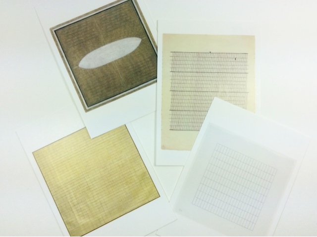
Agnes Martin
"More and more I excluded from my paintings all curved lines, until finally my compositions consisted only of vertical and horizontal lines"
- Agnes Martin, 1967
I was a bit worried beforehand that the exhibition might be boring (if not for me, for V at least), since Agnes Martin mainly painted and drew stripes and grids, and a lifetime's worth of stripes and grids can be a bit of a daunting thought. It turned out I was concerned for no reason at all and we both enjoyed it heaps. Repetition ≠ boring, repetition, more often = meditation. There's actually a quote on the exhibition leaflet from critic Lucy Lippard describing Martin's work: "legendary examples of and unrepetitive use of a repetitive medium", and I think she really hit the nail on the head there.
Most paintings on display at the Tate are 72" (183cm) squares, the ones painted later in life - when Martin had become older and more fragile - 60" (152cm) squares, which I can imagine being very much easier to handle, but there are some small drawings on paper there, too. I liked how the repetition spreads from the canvas to the size of canvases, it was a lovely constant to have Viewing the exhibition was a very different experience from any other exhibition I've seen; I just went into this strange mode where you suddenly have a connection with all these grids and stripes, and grids are suddenly the best thing in life. So, yeah, I definitely prefer grids to stripes, and I found out I have a favourite type of grid, too. The postcard at the bottom right corner in the above photo features a nice grid, but I'd prefer it sideways. Horizontal rectangles with very thin lines, approx. 1:2,5 - that's the perfect grid to me.
One painting really stood out, most obviously because of its uniqueness and materials. Friendship (incised gold leaf and gesso on canvas, 1963) has a gorgeous dim glow about it (and a great grid pattern) in real life; the above photo nor the postcard in the photo do it no justice at all. No surprise, I'm a big fan of gold leaf - it's just wonderful to have a material that seems to illuminate itself from within. Well, that's how it works at its best, when the gold leaf is not polished to a perfect mirror finish but has some character.
Naturally I'm terribly interested in the creative processes of other artists, and Agnes Martin's was really relatable to me. Agnes Martin had schizophrenia, so maybe the lines were a way of bringing order into her world, maybe they were something totally unrelated to her mental status. I'm not really all that interested in her personal history, it's sort of irrelevant, but I personally find my Aspergers has
something
a lot to do with the way I create and view art (and how could anyone's personality not affect the things that, basically, form the core of their personality... I just stepped into a weird vortex. Let's just forget it and continue, okay?). I find the thought of drawing hundreds and maybe thousands of lines with a ruler comforting as well as meaningful. I, too, think it odd to feel there's meaning in straight pencil lines, but why not? I'm not always quite right in the head, either. I just find it interesting that someone spent decades perfecting their spectacularly straight lines and created so wonderfully beautiful artworks in the process.
"My paintings have neither objects nor space nor time nor anything - no forms. They are light, lightness, about merging, about formlessness, breaking down form."
- Agnes Martin, 1966
The Agnes Martin exhibition at Tate Modern is still open until October 11th. Do go and let me know what's your favourite type of grid (or stripe)!
